Blogskin Sins

Every now and again, I’d do a bit of surfing to find out new and interesting blogs I could add to my bookmarks. There’s a lot of good blogs out there and its easy to be impressed not just by the quality of their content, but also the amazing design and layout some of these blogs have.
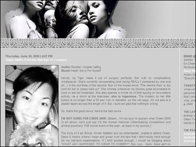
twentyfoursevens.blogspot.com

A lot of blogs use templates from Blogskins.com, and surprisingly many of these templates were done by 13-15 year olds. Seriously, their web design skills kicked my ass so hard, they made me looked as if I designed kennysia.com half-heartedly with my mouse clenched between my buttcheeks.
But those are the good ones. The bad ones, mannnn… they’re not just bad, they’re nauseating. If anyone reading this is using these skins on their blogs, don’t worry I’m not dissing you. Your content may be good, but PLEASE, do yourself a favour, give yourself a tight slap across the face and change the skin lah!
Here are some of the worst sins a Blogskin designer could commit.

1. Don’t force us to listen to your crappy music.

Blogs with background music are as invasive as having a stranger sticking his finger up your nose. If we want to listen to music while blogsurfing we’d have played Winamp. And if Winamp was playing when we dropped by your page, we’d be forced to listen to a collaborative remix between Norah Jones and The Crazy Frog.
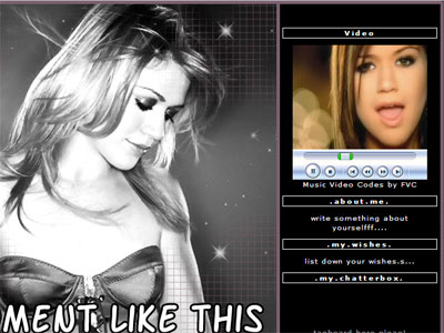
Come on! Why would anyone have MP3s that autoload on their blog? There’s even this skin that autoplays a whole freaking music video. It’s annoying, it catches us by surprise, and by the time your blog finished sucking up all our bandwidth we would have reached for the bright red ‘X’ button on the window because we couldn’t find where THAT GODFORSAKEN STOP BUTTON IS LOCATED ON YOUR WEBSITE.

2. My screen is 1280×1024. Your entries are in a 40×100 frame.

Blog entries written in frames effectively kill the use of my mouse’s scroll wheel, but generally I’m still quite cool with that.
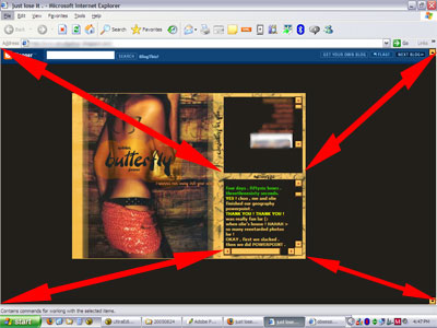
The blog entries are all in that little frame there. All the surrounding spaces = wasted.

Lately though, the frames been getting smaller and smaller and the background images (ranges from anime characters to random girl in provocative poses to some lame-ass celebrity like Britney or Avril Lavigne) just keep getting bigger and bigger. It comes to the point I’m staring at this picture and the blog entry constitutes just 10% of the my entire screen’s area. Worst of all, these entries are usually written in xxx-small fonts and in colours so bright they could make a blind man see again.
Please. We’re here to read your words, not look at your stupid background images.

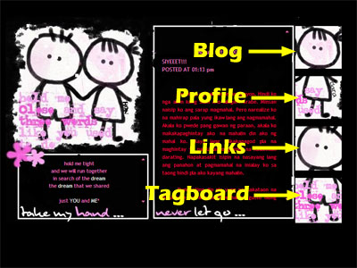
3. Hidden buttons are not cool, they’re irritating.
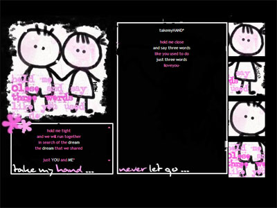
Cute, but… dude, where’s the blog?

It’s bad enough having to click an extra button just to get to your profile, links, tag-board, entries. You could at least make our lives easier by TELLING US WHERE THOSE BUTTONS ARE.
4. This wouldn’t have happened if they’re told the readability of their fonts is related to the size of their balls.

Sometimes I think these people design websites not for humans, but for ants to visit.
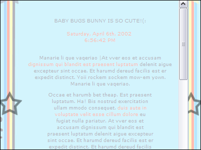
Try reading this without leaning forward.

How the heck am I supposed to read these words? I practically have to kiss the computer screen to be able to read what they wrote. Yes I know I can manually set my fonts bigger, but why should I? For God’s sakes, make your fonts larger.
I just want to read your blog, not go for a bloody eye examination.

Finally, to be bloglitically-correct, I must say this, “Its your blog and you can to do whatever you want.” ๐Ÿ™‚


I’ve received a lot of e-mails from people who are in the same predicament as I am following the entry on my Kuching/Perth dilemma. I’ve read through all of them and I’m grateful for the personal stories you shared as well as the words encouragement you all gave. I wish I’d be able to reply to each and everyone of them personally, but that’s quite impossible. In case you didn’t get my reply, please do accept my heartfelt thanks. ๐Ÿ™‚

95 Replies to “Blogskin Sins”

  1. haha. well said! esp the one on the blog written in frames. the screen so damn big, but the entry only one tiny little freakin corner. what a waste of space.

  2. I disagree Kenny. Most of those blogs belong to teenagers whose catered audiences are their own friends and nobody else. I don’think they should be told how they should or should not design their blog.

  3. Vincent, I think what you said is a case of blind leading the blind. No, these young people need to be taught and they should heed constructive advice from the experts.

  4. vincent + Tan Silly Latuk, nah I’m no “expert” and I’m certainly not teaching them how to design their own web. I’m merely writing down my observations from my blogsurfing that’s all. Its a trend these days to have blogs with all the above characteristics, you gotta admit that.

  5. just like how the ‘experts’ in kindergardens are teaching children that mothers should stay at home and daddys go to work? And the kind of ‘experts’ that tell us that a blog is not a blog when the ‘blogger’ is blogging about their own personal lives?
    Bah.

  6. I had no problems reading the text in the last picture, but maybe that’s just me.
    But God yes, GET RID OF THE DAMN MUSIC!! Especially those from a certain host iwebtunes.com, once you’re sway enough to visit a blog with a song hosted there, you’re done for! TONS of pop-ups, spyware, ads… the list goes on. Some are not so easy to detect and get rid of somemore. DIE, IWEBMUSIC!!

  7. You are absolutely right. Most web-owners realise that background music is indeed horrible, however, we’re talking about bloggers here. Most of them know nothing about what displeases their audiences.

  8. The last sentence just spoil the whole post’s, erm, fun~! But, nonetheless, its true. That should stop flame war from bursting. ๐Ÿ˜€

  9. Hah, even if the words are big enough, those 13-15 year olds will type in a fuck1ng 1rr1tating mAnn3r so called teen-speak.

  10. it’s a just a phase, I guess. (:
    I UsED To TyPe LiKE ThAt WhEn I wAs ThIrTeEn ToO.
    the tiny font really irks me though. even when I was a mere, juvenile, thirteen/fourteen year old kid.
    Kenny you’re good. ๐Ÿ˜€ keep those entires coming.

  11. amusing, although i’m fifteen, i have to agree w you,
    it’s really irritating how some blogs are designed.
    you have to click for 10 minutes to see the entries
    -.-
    and i hate it when people tyPe LyK diS aNd tHiNk iTs sOo keWlX`*
    :l
    nice entry (: i love reading your blog.

  12. haha…true..but osos that de blogs are our own expressions of emotions and all..so cant reali blame those hu are easily impressed..anyway kennysia.com rocks!!!

  13. Well written, Kenny.
    As a web designer myself, I advocate readability, usability and accessibility, and they are the primary concerns which should be addressed in a blog’s design/template.
    Content is important, but still, presentation is everything, and it’s the thin line which separates a reader’s action in one of two ways: forces him/her to reach for the “Close Window” button, or to stay for a while to read the ramblings within.

  14. I was shocked when I saw my cousin’s blog kena-ed haha… ahh well, like you’d said, “Its your blog and you can to do whatever you want.”
    I’ve music in mine leh… haha…

  15. hey haha sorry my blog is people help me find the picture one… hehe by the way thanks for saying its thing that i don’t know haha.. i’ll go edit to make it better thanks for your comments…

  16. agree. I used to make blogskins with big big fonts but then the kiddies didn’t like them. So I didn’t make skins anymore. LOL…and although I’m guilty of having music on weblogs, my friends emjoy the music I put up.

  17. i tend to like simple templates. my current one is a heavily modified version of my friend’s, which is incidentally heavily modified from the one he took from blogskins. i like black templates.
    black is not a color. it’s a shade.

  18. Oh wow…thank you for posting that screenshot of my blog. (The grey one at the top) My tracker’s been jumping wildly ever since. =)
    In all honesty, I would prefer a blog with a design like yours because the focus is then on the content rather than the fancy layout. So, to me…it seems that you’ve designed Kennysia.Com with focus on the good content in mind. ๐Ÿ˜‰

  19. i put sopngs on my blog, but its not autostart so you dont have to listen if you dont want to. everyone ends up happy =)

  20. some people make the fonts so small is because they deliberately want to make it difficult for viewers

  21. hi kenny. i feel your posts are good but these are teenagers. and i’m one myself. personally i CANNOT stand black and pink blogskins. haha but i was once like that. i’m cool with the small box and all, afterall, some of them are really good. amusing post though. keep them coming.

  22. hmmm…
    bloggers learn from stage to stage maa…
    some prefer to concentrate on contents
    some prefer to concentrate on design…
    so…
    river no offend with well la…

  23. unrelated but i had to reply to eyeris..
    i just had to say that i do think mother’s should stay at home (i’m female!)
    i have far too many reasons to fit in all into a comment box : )

  24. I cannot Cannot CannoT CANnot canNOT CANNOT forgive people who have blogs with a BLACK background and WHITE fonts. Or yellow fonts. Or red fonts. Or blue fonts. Why a BLACK background!?

  25. Most amatuer web designer / blog skin designers need to go to a few classes where they teach Human Computer Interaction and GUI Design.

  26. haha, that was interesting =P. anyway, I think many of their blogs are like that coz it’s for their own viewing pleasure? Just like for example, if you have no friends, you’d still make your room represent your style and character right? I’m sure quite a few of them want just their friends to read it and they tell their friends which button is which =P, well I know two of my friends who do that and one of them told no one she has a blog except me yet the design she downloaded from blogskins is reallly cool and prob. took her quite a long time to like prepare it and stuff eventhough i’m the only one who reads it =P. hey btw, I still can’t figure out how to download a skin from blogskins!! someone help me =(. i got an acc, yes (though i forgot it now coz i couldn’t figure out how to download) and then I had no idea what to do after that. I like diary-x where you can change your blogskin every so often an dyour old one wont be changed. anyone who can help me detail by detail, email me at midsummer_night_dream@hotmail.com please? lol, i tihnk help is unlikely but thanx anyway. sweet & sour dayz kenny and everyone else! =)

  27. indeed! u said it so farneely but it’s true lah – if i chance upon annoying sites with secret buttons-in-hiding and squinty text i’ll just leave and not bother to even read em.

  28. LOL… the last one, the font size is actually bigger than mine ;p hehe… I know mine is small so small… used to used big big font but doesn’t suits the design ;p I was thinking of making it bigger and what a coincident u actually came out with this post ahhaah… ah well..

  29. ah…i HATE certain sites where they put music and you don’t know where it’s coming from cuz i have multiple tabs and stuff. it’s ANNOYING!!!

  30. HaHa, Im with you on this for sure! Absolutely right!! I dont like it when the blog uses too many colours or fancy fonts and typing singlish .. hehe

  31. haha, someone actually helped me… thanx! =P oh, i just read some of the earlier comments and kenny’s reply. sorry, kenny, didn’t realise you were just referring to the trends ๐Ÿ˜› thought you meant how you were sometimes frustrated with others’ blogs =P I myself go crazy with pictures of realistic and life looking butterflies, faeries and mermaids, will only use a blogskin with one of those. wonder if there are any out there with pictures by david delamare (my absolutely fav. artist) or maybe selina fenech, renee biertempfel, the realistic looking ones by amy brown or maybe even some from fairyvisions.com…lol, ok, went on too much, shall stop now. Hey kenny, what do you think future blog trends will be like?? lol, i can imagine u doing a entry on that and all these funny images will be up. lol. i just know that even future blog trends won’t be attractive to most and older age groups ๐Ÿ˜›

  32. I totally agree on that “blog in tiny frames” portion. And anything that requires too much time to load is just a waste of time.
    Then again, it really does cater to different readers right? So to each his/her own. :O)

  33. Yeah. Till now i still haven’t found my blog a nice skin with real big words…. But I like PinkShoeFetish’s, the words are big enough…

  34. Me, myself’s a designer there too. Although the current skin was top first but what i did was designed of what THEY want & is not that i really want . But for my blog, i still prefer to design it in my OWN style. haha (: I still love your blog afterall.

  35. “but for ants to visit.”
    *LOL*
    Eh my fonts are small also leh.
    So how?
    Hee hee, Uncle Kenny getting old and blind maybe
    *runs off before getting swatted*
    But yeah i DETEST the music on blogs. Farking irritating. I always rush to close the window the moment some crap starts intermingling with my playlist.

  36. You are absolutely right! I definitely agree with you! Especially those clickable navigation images, THEY ARE A WHOLE LOAD OF CRAP. I can’t stand it when the images go hiding in the whole skin and I have to search for them.
    I think the worst part is, the sTiCkY cApS and peeooopplleez sppeelliingg liikeex thiissxzxz. How I wish I can slap them.

  37. Your blog reminds me of one of the reasons I don’t bother with Bloggers “Next Post” button anymore… at first I was keen to just explore what was out there… but… having annoying pop-ups, and some autoload things that seemed like viruses or trojans or something was bad enough…
    then there were all those sites with music (yep, totally invasive! and if you are surfing @ work, better have those speakers OFF or else kantoi!!)…
    then so manny of them.. yeah.. unreadable… horrid black & pink designs lah, too-small fonts lah, or hidden buttons that appear only when you are lucky enough to pass the mouse over them… pening!
    So too bad lah, I wanna explore but doing randomly not worth it, so I stick to exploring other people’s lists of blogs on their sidebars :p Or comments.
    Cheers!

  38. I do believe that some people blog for their own pleasure and some just for the sake of showing off to their friends..that’s why they go through all the fuss of making it up so “nicely”..I’m one of the former and sometimes I do go through other peoples’ blog and I have to agree it’s pretty irritating to hear all the “lovely” music and test my eye-sight with the tiny fonts..Cheers to those who have designed all the unique blogskins,though I’m more of the back-to-the-basics kind of blogger..templates suits me fine..

  39. I know its their blog and they’re writing for their friends and all that, but answer me one question – would you like to read kennysia.com in one of those layout?
    iLix, yea something like that. I’m getting very busy at work so my updates won’t be as frequent. I’ll still update but my entries won’t have as much “flavour” as before. Sorry. ๐Ÿ™‚

  40. even my kind of ‘sms shorthand writin style’ gets shot @ by many pple online, wats more dan e kids style of writin with alike-sound-words…

  41. tell me about it. some skins are cute, granted, but where the fuck do you click? it’s like you gotta be sherlock holmes to figure out where exactly is the button that reveals the blog content. geez.
    used to have music on my blog, but found it irritating myself. not to mention that my friends were starting to complain. so yeah, now minimalism is the operative word here. clean, plain, and easy to read.
    i think that’s how a good blog should be, forget about the fancy schmancy shit that just confounds and annoys.
    so yeah, i rather you retain your skin than use something damn canggih but ultimately confusing, not to mention a long wait to load.
    nice to see that you’ve got into the spirit of merdeka. LOL. urgh. no malaysian flag on my blog. *langsung not patriotic*

  42. Come to think of it, the music part I only agree with yours half. Depending on what music/songs they put. Some are really nice which I decided to download. But if they are putting pop songs or really crappy songs, sorry lah~! I am going to close the window.
    At least, my 2 minute instrumental song wasn’t that bad. (I put songs when I find it really nice and it is short.) Besides, there are a few visitors requested for the song. ๐Ÿ™‚

  43. Some good points there. I hate it when I enter a blog and I hear background music especially when I have my own music on. The video just makes things even more irritating. Like you, I dislike hidden navigation as well as text that are too small to read.

  44. oh yeah. i totally agree with you.
    you forgot one point about the way teens type nowadays. most retarded teens type lYk tHisH. “i luB euUu” and whatsoever. its getting on my nerves!

  45. agree that some blogs’ words are too tiny and faded and I have to squim my eyes to read…
    blogs with hidden links is a bother and trouble. links that are clearly stated is better…
    i hate blogs with videos… slowing down the connection of internet… background music is ok but better not have it. And, And, iwebtunes.com is a virus infested website!
    the entries box, the bigger the better but not too wide… with all the links just beside the entries box.

  46. I don’t blog, I’m twelve, but I don’t entirely agree with what you’re saying.
    I’m crazy, but hey, you don’t have to ridicule others’ blogs. Who asked you to read them? There are thousands and thousands and thousands of blogs out there, read the others.
    Although auto-load + looping music really irks me.

  47. exactly! its irritating to have 2 songs to play at the time. and i have been looking around for a plain simple blogskin like yours. but NO! all my results are hidden pictures. and craps.
    ERGH! blogspere is ruined by teenagers!

  48. haha…u’re rite…sum skinners hv no brains @ all…..hey im a noob @ skinnin but thx for those points on wat pple hate bout sum blogskins….i’ll heed them wen designin my own skins…. ๐Ÿ˜‰

  49. Yeah, I agree. Especially the I-WEBS music…Damn thing.
    Wah lau eh, you enter the blog, first thing come out pop-ups, advertisements, spyware thingie, etc. And worst la, sometimes when I enter my friends blog rite…While reading, the “Internet explorer problem” come out. The Send or Don’t Send thing. Liddat how to read???
    So visit a blog got I-WEBS music or music that you totally can’t stop rite…”Swaey”.
    Unless you extremely lucky la…Like that song.
    And I have a problem with little entry boxes and big big pictures. Lau eh, it’s not like you’re gonna analyze the picture rite.
    What makes the hidden navigations worst is it sometimes the navigation are scattered all around the pages, or so tiny that you can’t find it.
    ARGH!

  50. yeah, I extremely agree with Jinx:
    oh yeah. i totally agree with you.
    you forgot one point about the way teens type nowadays. most retarded teens type lYk tHisH. “i luB euUu” and whatsoever. its getting on my nerves!
    Posted by: JINX at 03 September 2005 1:21 PM

  51. HAHA WHAT YOU SAID ARE SO MY THINKING OF THOSE BLOGSKIN MAKERS.
    & BLOGSKINS CHOOSERS.
    BUT HEY!!! I AM A BLOGSKIN MAKER TOO & GUESS WAD, IM 14! LOL.
    I LOVE MY FONTS BIG TOO HAHA.
    EASIER TO SEE.
    MY BLOG IS THOSE KIND OF SCROLL-DOWN KIND & NOT THE LINK-LINK KIND LOL!!!

  52. Hey, man. Nice blog. But – maybe it’s something 2 do with me being an 11-yr-old – i dun c anything wrong with da last 2 examples, meaning the hidden links one and the one that u said u couldn’t read. 4 ur info, i read it with no problem except 4 da fact that i dun understand da language. and next time u c a blog with no posts, try scrolling everywhere. i noe u’re not that stupid – no offence.

  53. I’m using one now and yeah..I kinda don’t like the size of the fonts..too small..
    Nice post by the way…
    รขโ„ขยฅ~God Bless~รขโ„ขยฅ

Leave a Reply to She's Jess Cancel reply

Your email address will not be published. Required fields are marked *

Navigation